
YouTube’s new player design has sparked a wave of criticism from users
- AYG -
YouTube decided to celebrate the anniversary of its first video not only with memories, but also with changes to the web player interface. The platform launched a test of the new design for a limited number of users, but it was met, to put it mildly, coolly.
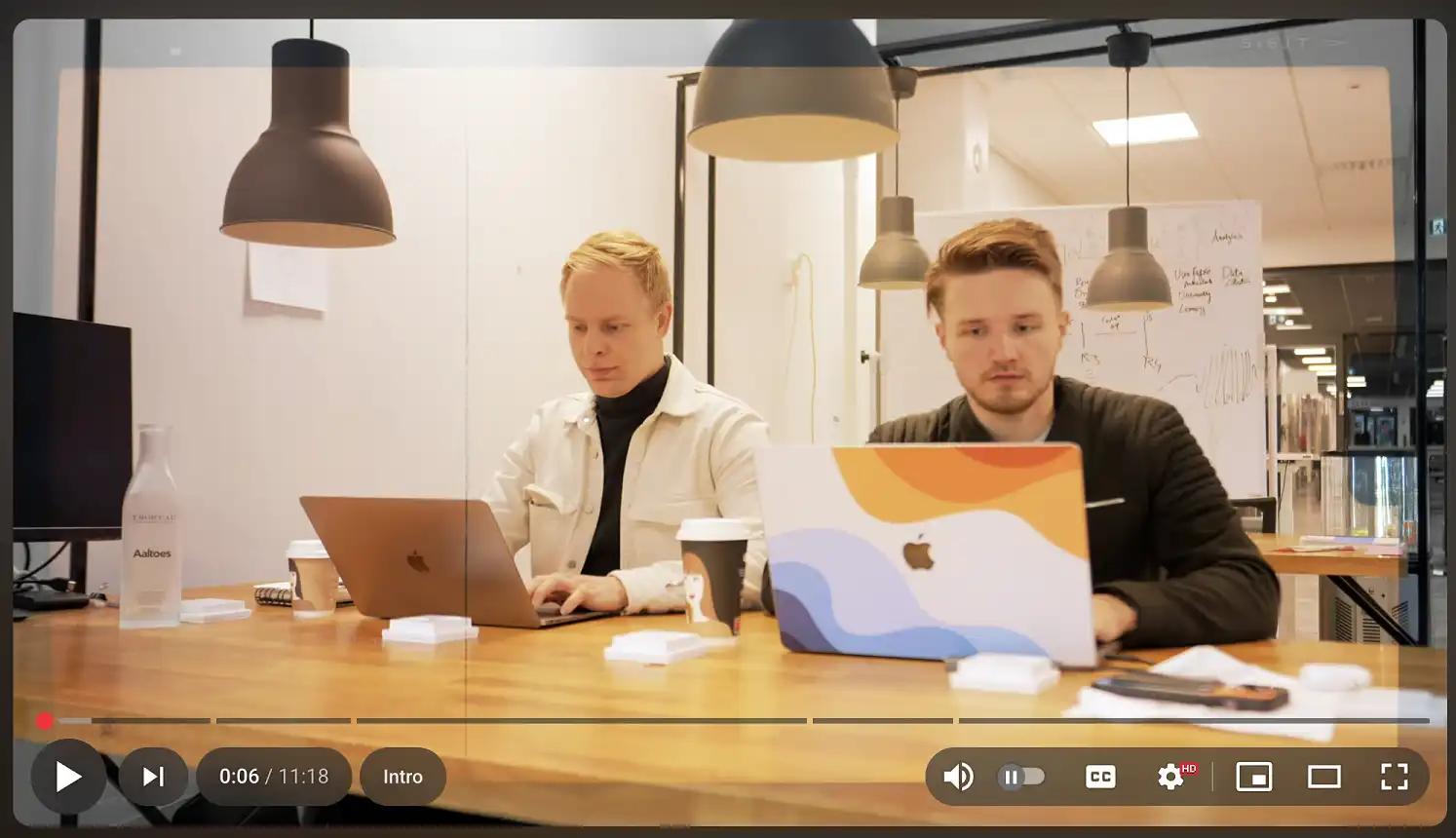

Screenshots demonstrating the updated player have already begun to appear on Reddit. The main difference was the redesign of the control panel: now each element is a separate button placed on a visually separate “island”, which is radically different from the usual solid block. The movement of the volume control icon was especially negatively perceived – it was moved to the right, removing, apparently, the traditional slider. Commentators call the new element inconvenient, and sometimes even “terrible”.
Although some of the audience appreciated the changes for their visual “cleanliness” and “neatness”, most users expressed disappointment, criticizing not so much the appearance itself, but the decrease in usability. At the same time, Google has not yet officially announced the redesign, and it remains unclear whether the interface being tested will become the new standard for everyone.
Tags :
News
Leave a Comment