
Google Updates ‘G’ Icon for the First Time in 10 Years
- AYG -The corporation presented the first update of its signature four-color icon in 10 years. The main change affected the gamma solution – instead of precisely separated blocks, this time a measured gradient is used, where shades gently flow from one familiar color to another. The fresh design preserves the logo’s recognizability, but gives it a dynamic look that is relevant by today’s standards, corresponding to the current visual style.
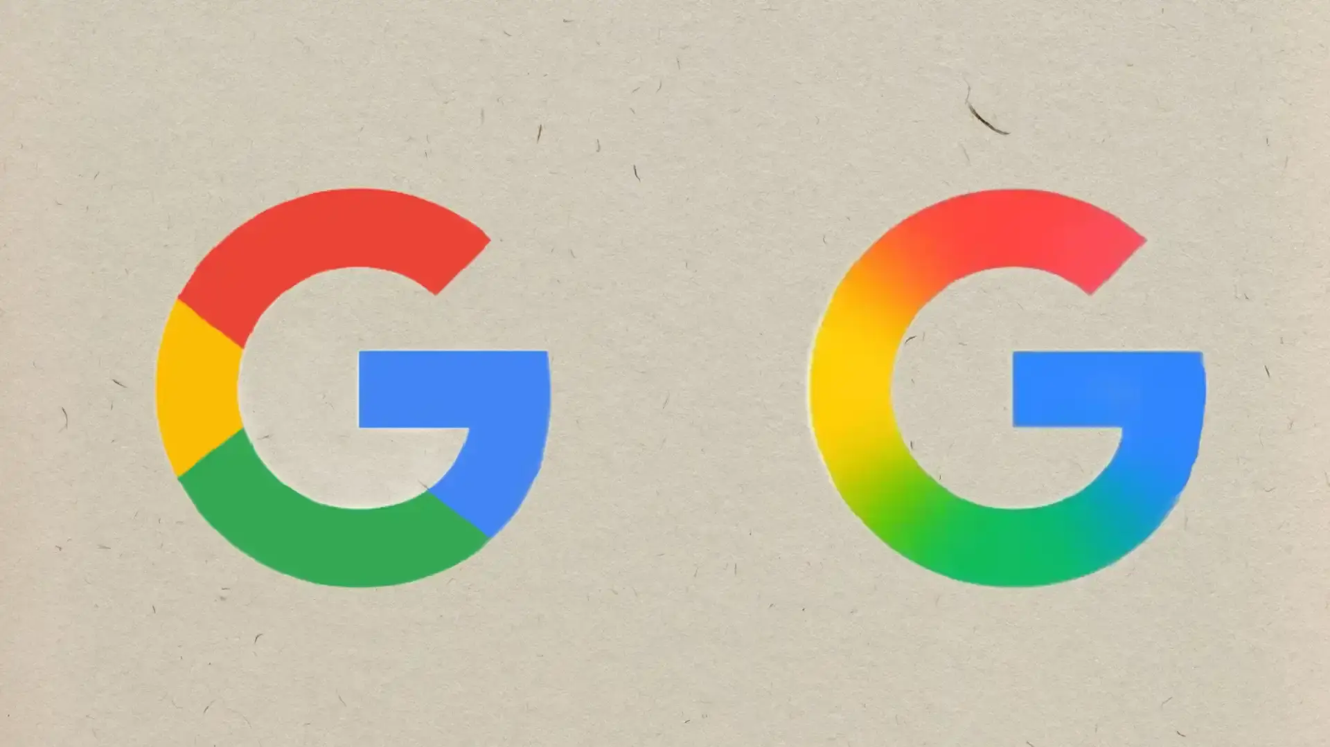
The last significant rebranding was made in 2015, when the Product Sans font and a round four-color icon were introduced. The new update harmonizes the “G” style with other products, including the Gemini and AI logos. Currently, the new icon is available exclusively in the Google Search app on iOS and the beta version of Android, while web versions and other services are still using the current version.
Tags :
News
Leave a Comment